Image from:

Writing in all caps found to be 150% more persuasive
News
Science
The Hecrenews Science and Research team is back again with another most interesting finding. In order to get to the root of persuasive editorial creation (coming soon to a hecrenews near you!), we measured the effects of various text formatting schemes on persuasive skills, and audience response in general. The highly esteemed Sheeple Dunell, official smartypants of the Science and Research team, presided over the investigation. In an excerpt from the upcoming paper on the findings, Dunnell describes the experimental setup:
The experiment was conducted by varying the size, capitalization, message, and colors of the text on a large poster board. Hecrenews’s very own Blat Beck volunteered to hold the sign, letting passerby view the sign and react to it. We elected to thrust Blat into the midst of some random protest each time we conducted a trial, to make the sign seem more in place. The good thing is, there were lots of these protests, so we could practically just push Beck into one, record a couple reactions, then walk a block or two until we found the next one (find out why the people are in uproar soon!). I give it a 10/10, very easy process.
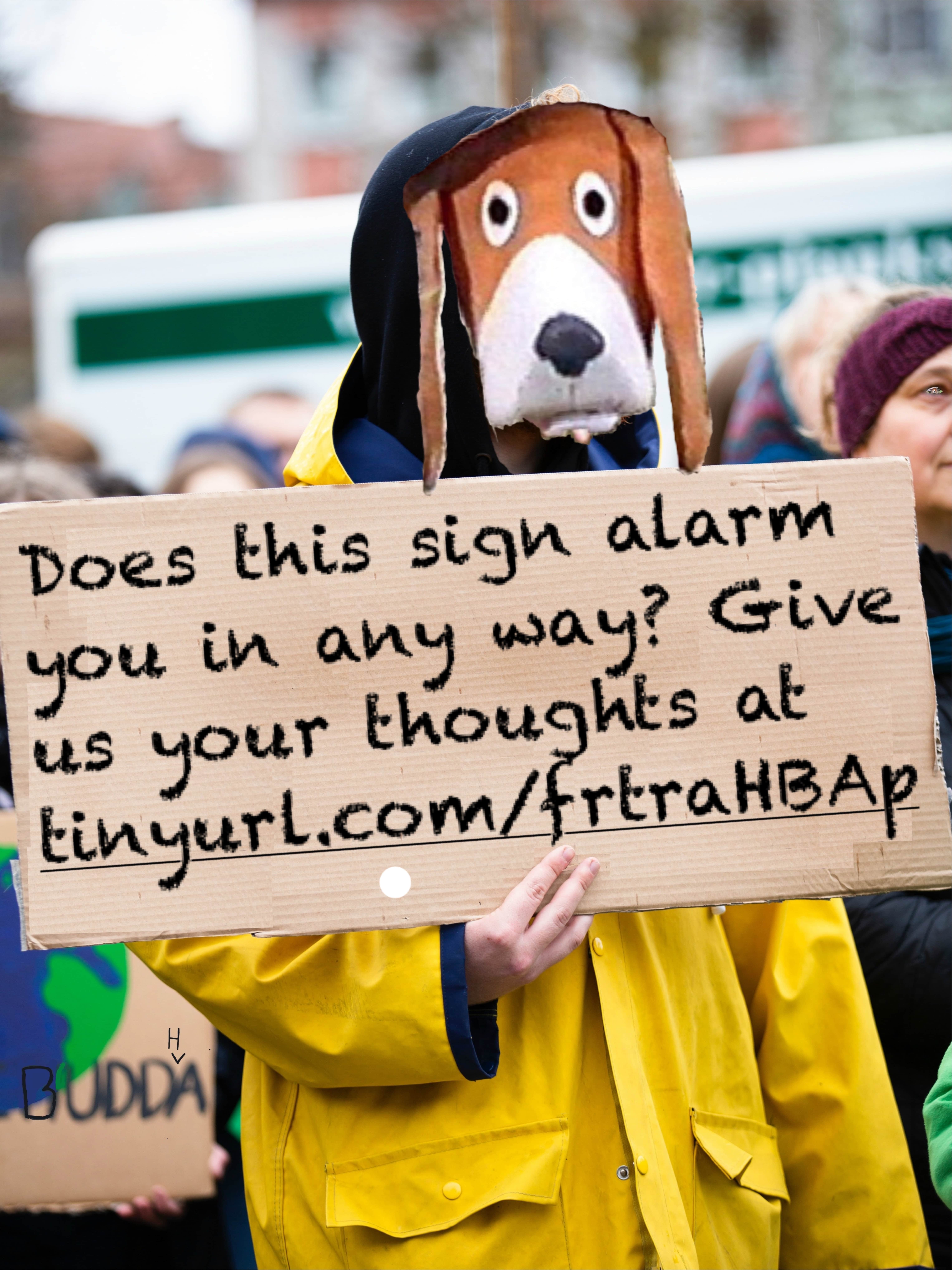
As a control for the experiment, Dunnell and his team decided to have Beck tote around a very dry sign, with lots of body text and an actual link that people would have to fill out instead of a QR code. When asked why this obviously extreme sign should be used as a control, Dunnell said “E = mc^2, and Newton weighed more than Bohr.” The control setup is pictured below:
This sign received mixed reactions. Some passerby were observed to be furiously tap-tapping away on their mobile devices (although it’s uncertain as to whether this was caused by the link on the sign, or if people are generally attracted to their phones), while others visibly recoiled from the wordy text and gave poor Beck a wide berth. Noting down the civilian response, Dunnell and his team made slight adjustments to the design.
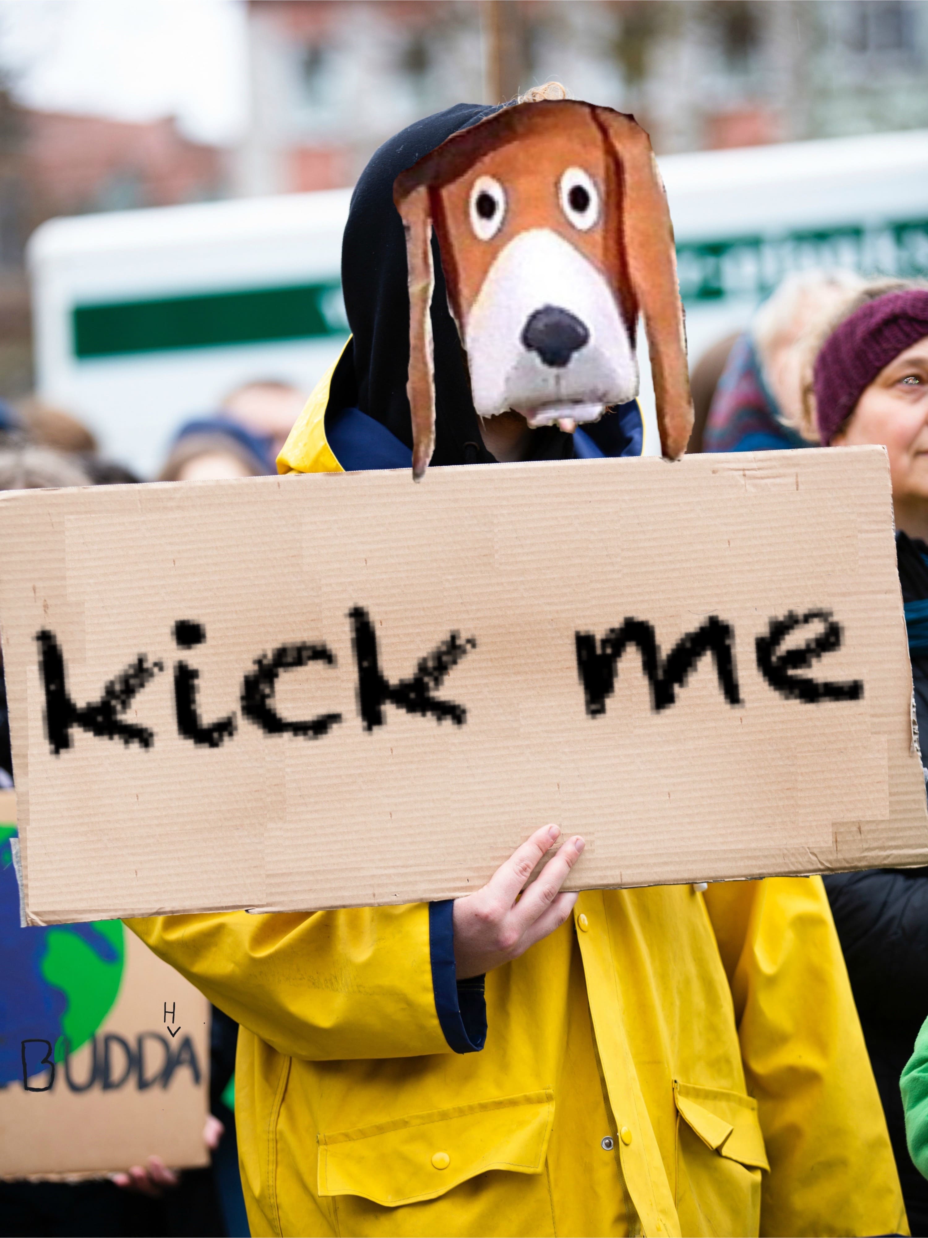
Their next setup is pictured below. Instead of a wordy message, the team decided to try a quick, memorable call to action. The first trial using this statement was in lowercase. The team thought that since they weren’t capping any of the letters, the pedestrians would heed their honest, clear command.
Tragically, this message had almost a null result. Only one pedestrian even showed any notice to Blat Beck, and that was only to tell him to “shove off, you’re in my way”, at the unidentified pedestrian attempted to cross a street and found his path blocked by a protest, with Beck being the closest individual.
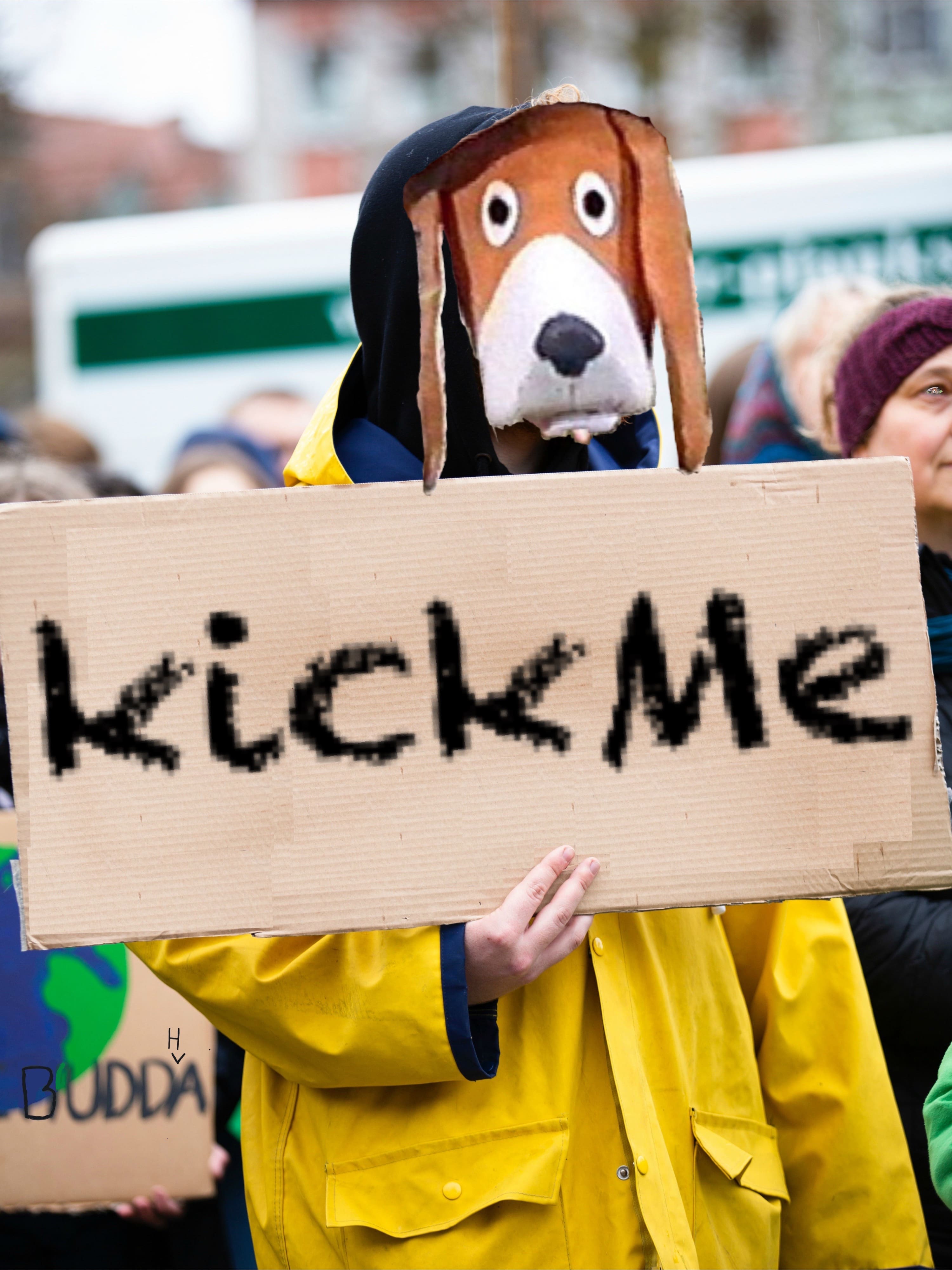
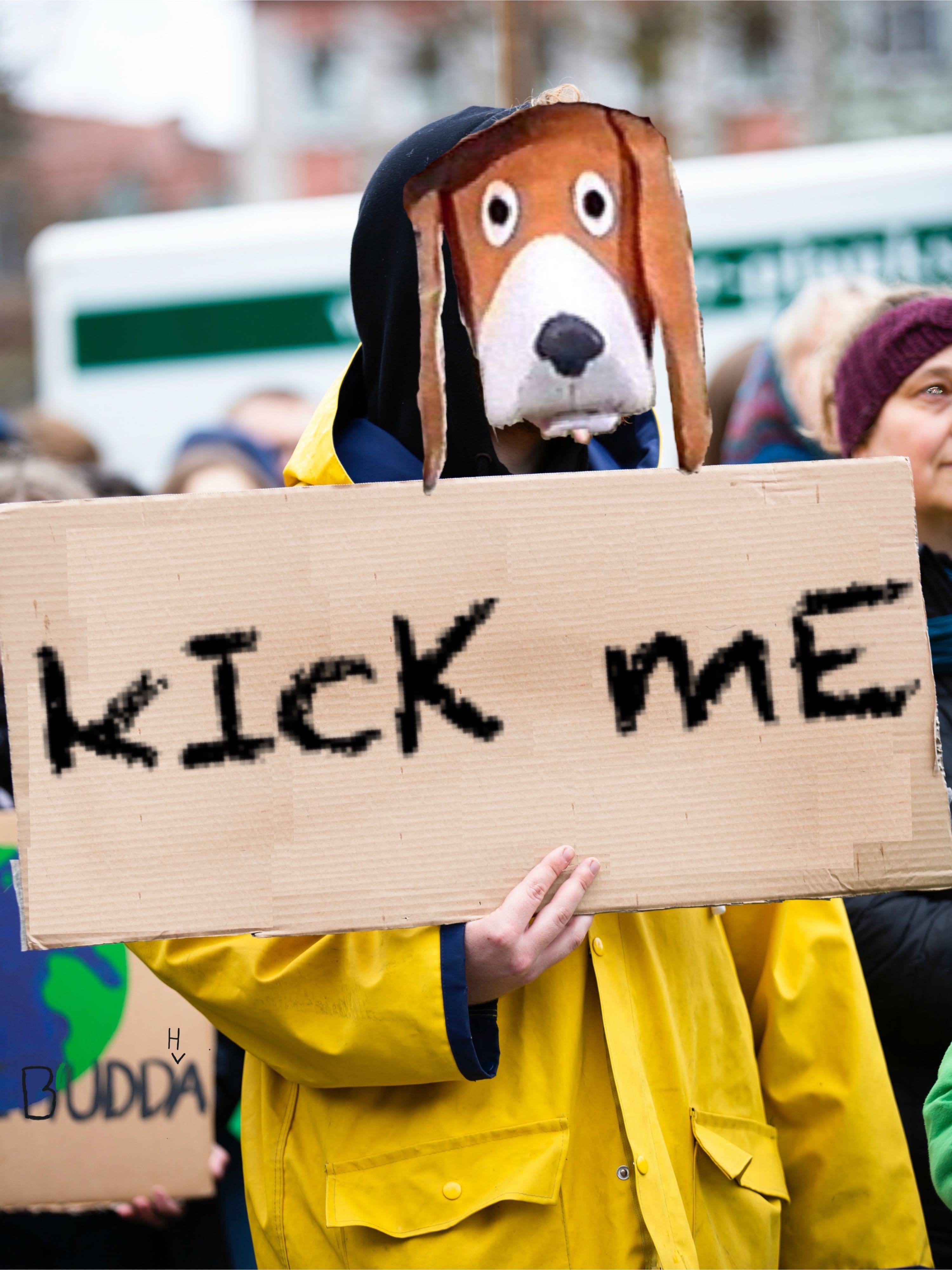
Resolving to try and make the message stand out more, the team decided to capitalize one letter at random, resulting in the below format. Completely by accident, the bumbling fools we feel ashamed to call researches had written the message in camel case. Their hypothesis for the bystander interaction with this sign was that “the side-people, they’re all too lazy to read all lowercase letters, so they’ll skip to the second word, and recognize lil’ Beck, even if they don’t do any kicking. Soon, Blat Beck will get what he deserves. Soon…”, according to Science and Research intern Eif al-Tawa.
The result was more or less identical to the hypothesized outcome, but with slightly less definite reactions. A middle-aged white lady holding a pack of M&M’s did look at Beck, but only through a passing glance, as did her poodle.
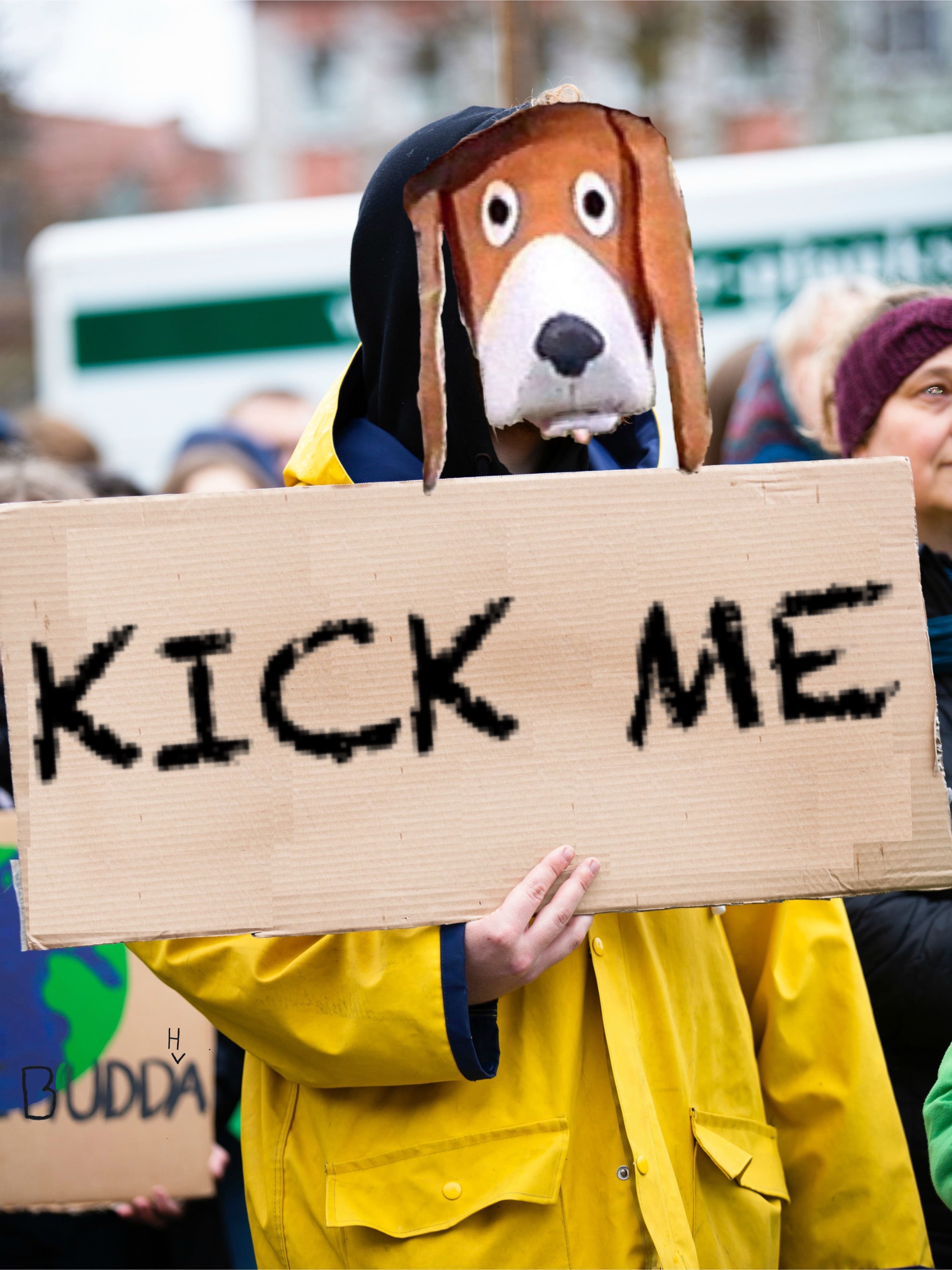
Dunnell had no choice but to try and get even more persuasive. To attract even more attention. He chose a tried-and-true method: ALL CAPS. The larger the letters, the better the engagement, and the higher the persuasion, the team believed.
And it turns out, that for one time in their career, the researchers were right. The fully capitalized sign attracted lots more attention. One or two of the passerby even gave Beck a kick, demonstrating just how great the persuasive power of the method was. However, this good news came with a caveat, as even now, the researchers are trying to determine whether Eif al-Tawa bribing the two men to kick Beck “good and proper” was a significant interruption to the experiment. While a portion of the team occupied themselves with that, the rest strode on.
For no apparent reason whatsoever, the team then decided to format the message in a way that resembled the formatting used for Hecrenews images.
The result was positive, if confusedly so. A few “people” began walking mechanically towards Beck and proceeded to kick him, one time each. Then they left. Beck, with a smarting backside, said that the situation was “real sus”.
The next design visited was a rather colorful one. Thinking that the bystanders would have grown bored of plain, black letters on cardboard, the research team decided to spice it up a bit and give each letter its own unique color. Hours were spent selecting just the right mix of colors to be extra persuasive, resulting in the image below:
Most people gave Blat a wide berth, and one was noted saying “MY EYES! OOHHH THE YELLOW!..” The research team is unsure as to whether this is a complement or criticism of the design, as at least the person noticeed the sign.
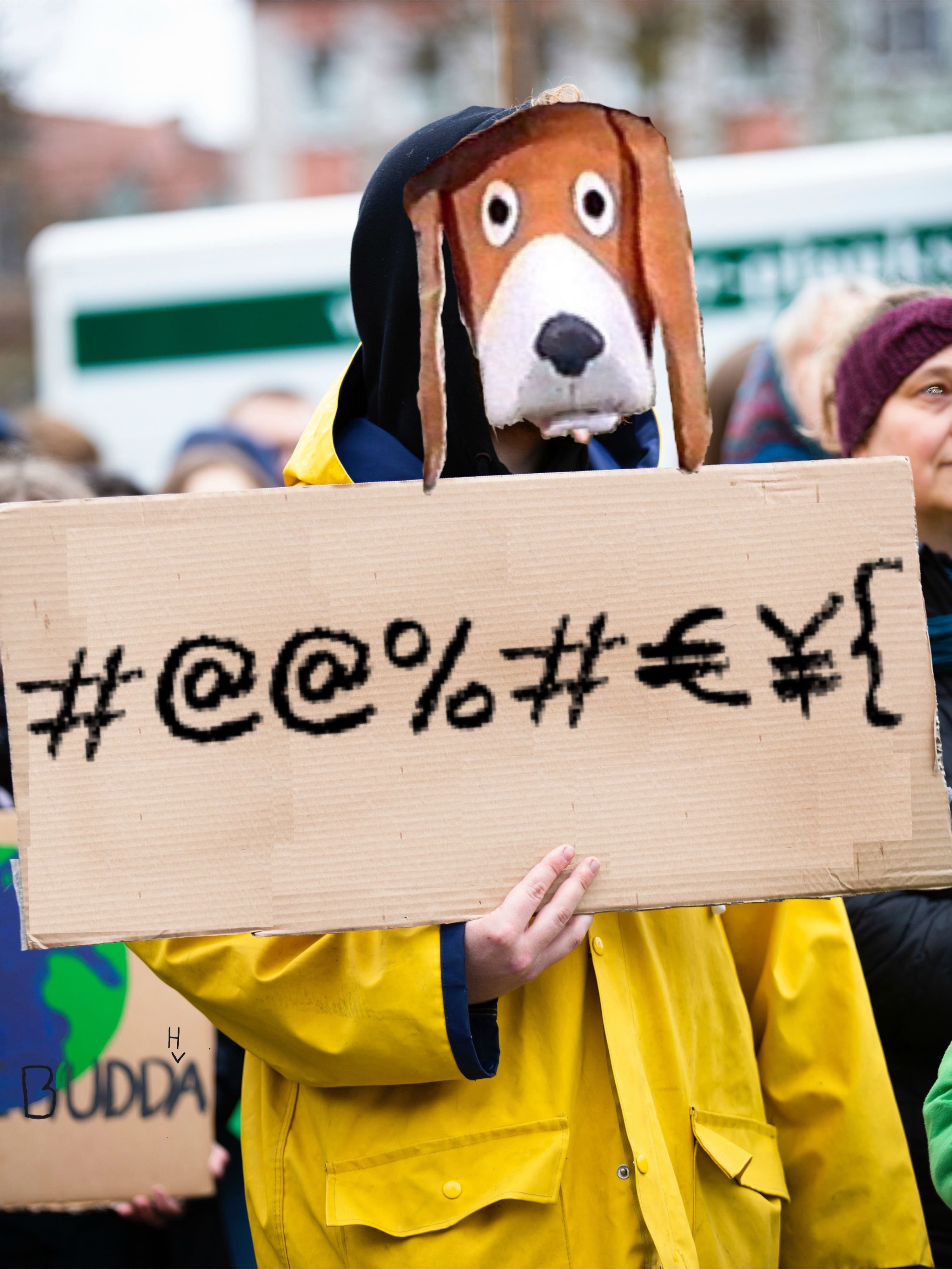
The next design visited was also a rather colorful one. Figuring that nobody would be enticed by normal letters, Donnell tried symbols. To be precise, he ordered al-Tawa to mash a couple numbers while holding the shift key, resulting in the image below.
The only significant deviation from other trials was that an old man walked over to Beck and told him to “Mind [his] manners, mister”. The old man raised his cane as if to show Blat Beck he meant business (eliciting a whoop from Eif al-Tawa), but the situation was defused by a profuse apology on Beck’s part.
Donnell’s team dug hard to find another method of capitalization, and tHeY fInAlLy DeCiDeD oN tHiS mOnStRoSiTy:
The reactions were entirely inconclusive. Nobody reacted in an unusual way, except for a couple “memers” who gave Beck a wide berth. The team concluded that there wasn’t a soul that had the social intelligence to decipher the discombobulating mix of capitalized and uncapitalized letters.
Feeling slightly disheartened at the lack of violence, Eif al-Tawa started a motion to change the message for future trials. For “only scientific” reasons, Blat would now carry a sign with the most, derogatory, downright evil message possible. It pains me have these words stain a media type as holy as a Hecrenews Article, but here you go:
As soon as Beck got out of the shiny Hecrenews white van, the tension was palpable. Every single streetgoer, most of his fellow protesters, and most prominently, Eif al-Tawa gave him a murderous look, then started beating him left and right. In the fray, somebody shouted, “That’ll teach you for stealing my Yoo-hoo!”. In addition to various other wounds, Beck received a black eye and several tomatoes to the body. Beck wasn’t in good shape by the time the team intervened, and requested to have a break, or some financial compensation for his numerous injuries, or something.
But instead, those researchers, exhorted by al-Tawa, sent him out again, this time with an even more inflammatory text. Using what they had learned from previous trials, the researchers immediately sent Beck out with the same message, but this time with all caps and puntuation at the end. The below image is how Beck looked immediately BEFORE going out, as the image after would have been too obscene to display on this article.
Blat Beck was completely fine and had a wonderful time, kappa. In reality, a lynch mob formed within seconds of Beck joining the protest and did what lynch mobs do best. Blat Beck was injured so severely, he had to be airlifted out of the situation. From a hospital bed in [REDACTED], Beck describes his ordeal: “As soon as I stepped out, it was a tangled sea of limbs and tomatoes…and knives? My memory of the day isn’t that great. It’s almost like the mob was rented beforehand and just pounced when… wait a minute.”
The Hecrenews is currently facing a lawsuit on this in addition to our other one (see here). Updates on our swiftly sinking legal ship coming soon (Boy, we really will market anything as news).
Going back to the experiment, Sheeple Donnell published a preliminary report on the results, stating that “Caps Lock and multicolored seemed to be the most persuasive and least damaging, although random symbols have some merit and should be explored further”. So, whenever Hecrenews editorials come out, be sure to expect only the most persuasive of formatting. All caps, randomly colored, with a couple nonsense symbols thrown in. According to this study, this will resonate perfectly.
